Graphing Sea Ice Extent in the Arctic & Antarctic
Students create graphs of sea ice extent data for the Arctic and Antarctic, learning about both annual, seasonal cycles and longer-term trends. Visualizations complement the data analysis, allowing students to view animated maps of the data.
Learning Objectives
- Students will practice asking questions and stating and testing a hypothesis.
- Students will practice graphing data and interpreting those graphs.
- Students will apply their understanding of the seasons and seasonal variations within Earth systems.
- Students will learn how climate change is affecting Earth's polar regions.
Materials
- Graph paper for each student group
- Colored pencils or markers
- Computer or tablet with Internet access to view animations and interactives (optional)
Preparation
- Print copies of the Graphing Sea Ice Extent student directions.
- Print copies of the Sea Ice data tables.
- Cut the tables apart so you can hand out each table at appropriate times during the lesson without "giving away" what is coming next.
Directions
Part 1: Seasonal changes in sea ice
- Briefly explain to your students that the Arctic Ocean has a large area that is covered with sea ice and that the size (extent) of the area covered by sea ice changes seasonally. Show the students a map of the Arctic to situate them.
- Tell your students that they will be analyzing the variation in the extent of sea ice near the poles over time.
- On the board, draw the x and y axes of a graph with time on the x-axis and amount of sea ice on the y-axis (with a general range of less to more).
- Ask your students to make a hypothesis about the extent of sea ice in the Arctic throughout the year. Have them predict which month will have the greatest amount of sea ice, and which month will have the least. Have the students predict the shape of the graph of sea ice extent over time by sketching in a curve on the graph of how they think the sea ice extent varies during a year. Invite several students to draw their hypothesis if there are differences of opinion.
- Distribute Data Table #1, which lists sea ice extent in the Arctic on a monthly basis over several years. Ask your students to graph the data (or a portion of the data - at least a year). Instruct students to include time on the x-axis and amount of sea ice on the y-axis.
- Have your students compare their hypotheses (the "prediction curves" the class sketched) with the plots of actual data. Discuss any discrepancies between their predictions and the results based on data, and the significance of those discrepancies.
- Ask your students to determine which month each year had the greatest sea ice extent. They should note that the three peaks in the graph all occurred in the month of March. Next, have students determine the month with the least sea ice extent. The annual minimum extent was in September each year.
- Next, have your students make a hypothesis about the variation, on a monthly basis over the same period, of sea ice extent around Antarctica. Show a map of Antarctica and the Southern Ocean to help orient the students. As before, have them sketch in "prediction curves" on the board.
- Provide your students with Data Table #2, which lists sea ice extent in the Antarctic on a monthly basis over the same period. Ask your students to graph this data on the same graph as their Arctic ice data. Figure 1 shows a plot of the actual data from Data Tables #1 and #2 for 2016-2018. Have students add a key on their graph with colors used for Arctic and Antarctic.

Figure 1: Monthly Average Sea Ice Extent - Arctic & Antarctic - 2016 through 2018
- Once again, have students compare their hypotheses (the "prediction curves" they sketched in) with the plots of actual data for the Antarctic. Also, have them compare the curves for the Antarctic with those for the Arctic. Ask them to identify the month with the minimum (February) and maximum (September) sea ice extent in the Antarctic. Again, discuss any discrepancies between predictions and results, differences between the curves for the opposite hemispheres, and possible sources of those discrepancies and differences. It is likely that students may have some confusion regarding the causes of seasons and how the seasons differ between the Northern and Southern Hemispheres. You may want to review these concepts at this point in the lesson.
- Have students view the animated maps of sea ice extent in each hemisphere and compare them with their graphs. This step is optional and can be omitted for the sake of time. As an alternative, you could include this computer-based section of the activity at the end, so you don't interrupt lesson flow by having students transition from graphing to the computer and back again.
Part 2: Longer-term trends in sea ice
- Hand out Data Tables #3 and #4. The tables show the sea ice extent in the Arctic and the Antarctic during the months when the ice extent is at its minimum (September in the Arctic, February in the Antarctic) and at its maximum (March in the Arctic, September in the Antarctic) for a number of different years. The tables provide data at 5-year intervals starting in 1980.
- With data from Data Tables #3 and #4, have your students make two graphs:
- a graph for the annual maximum extent of sea ice for the Arctic and Antarctic
- a graph of the annual minimum extent of sea ice for the Arctic and Antarctic.
- Have them use one color for the Arctic data and a different color for the Antarctic on each of their graphs.

Figure 2:Yearly Maximum Sea Ice Extent

Figure 3: Yearly Minimum Sea Ice Extent
- Ask your students to describe any long-term trends they see in these data. They should at least notice a significant reduction in sea ice extent in the Arctic in September (Figure 3); the extent in 2015 was 40% less than in 1980. The Arctic maximum extent in March has also gone down (Figure 2), though less dramatically than the Arctic minimum extent. There hasn’t been a strong trend, either decreasing or increasing, in the Antarctic for either the annual minimum or the maximum.
- Have students view the interactive maps of sea ice extent in each hemisphere and compare them with their graphs. This can be done as a whole-class discussion if you can project the interactives. Have them pay special attention to the maps of the Arctic in September to see if they can spot a long-term decline of ice extent in the map views. This step is optional, though recommended.
- The models that climate scientists use to predict the effects of global climate change indicate that warming of Earth's climate will be most severe at high latitudes and the effects will be noticed earlier in the polar regions than at other places on our planet. Climate scientists believe these effects are already being felt in the Arctic, and that changes in sea ice extent are one such noticeable effect. Facilitate a discussion of these issues with your students.
- Ask your students to predict, based on this data, in what year they think the Arctic would be ice-free in September if the current trend continues. Ask them how reliable they think their prediction might be.
Assessment
Formative assessment: Look over the sketches students make for the three-year duration, month-by-month graph of sea ice extent in the Arctic. These "hypothesis" sketches will reveal their preconceptions and can help you know what to emphasize throughout the rest of the activity. Some possible student sketches, and what they reveal about student thinking, include:
- A straight line sloping downward might indicate that a student has heard something about warming in the Arctic, and assumes that means ice extent is declining. A sketch of straight-line decline would, however, indicate that the student wasn't thinking about the seasons and the annual rise and fall of temperatures throughout the year.
- A sine wave-shaped curve, with "peaks" and "valleys" of about the same height and depth each time would indicate that the student was thinking about seasonal variation, but not longer-term trends.
- A sine wave pattern combined with a declining trend might indicate that the student has a fairly sophisticated notion, with both seasonal and long-term trends both represented. The student might mistakenly expect this rate of decline to be much steeper than what occurs in reality, as shown in the l data.
- Students that do include the annual rise and fall of sea ice extent are most likely to assume that the peak extent comes in the middle of the Arctic winter, in December or January, and that the minimal extent happens in the summer, in June or July. Both extremes actually come a couple of months later as the ice continues to build up or to melt away well past the dates of the winter and summer solstices.
Formative assessment: Review student hypothesis sketches of monthly sea ice extent in the Antarctic. They might reveal that:
- Students don't realize that seasons are reversed in the Southern Hemisphere. Most students will probably draw the peaks and valleys of their sketches in about the same places as the highs and lows on the Arctic data plots. Actual data reveals that the shapes of the Arctic vs. Antarctic data plots are almost direct opposites, with peaks matching valleys and vice versa. This provides a great opportunity to revisit the topic of seasons with your students.
- Students added in some aspects of the shape of the Arctic curve, based on actual data plots they created, to their hypotheses about the Antarctic. For example, if a student did not include annual, seasonal variation in their Arctic hypothesis sketch, but did add that aspect to their Antarctic hypothesis sketch, you might assume that they noticed that aspect while working with the actual data for the Arctic.
Check for student understanding.
When you ask students to describe any long-term trends in the data, they should notice a significant decline in Arctic sea ice extent in September. The Arctic ice extent has also been declining in March, but less dramatically than the September value. Your students might not notice the more subtle slope of the Arctic-March plot. There is not a clear trend, either rising or falling, in either the February or September data for the Antarctic. The Background Information section of this activity provides numerical values about the long-term rates of change of sea ice extent for both hemispheres.
Discussion topics and links to mathematics
When you ask students to predict when in the future the Arctic might be ice-free in September, discuss with them the reliability of their predictions. A simple, linear extrapolation based on such a limited set of data might not be especially reliable. You may want to discuss, at this point, various mathematical and scientific concepts, such as:
- functions/curves that are linear versus curves/trends that are not straight lines;
- uncertainty, error bars, and other intermittent fluctuations in data sets that make it difficult to make predictions based on a small number of data points;
- the scientific phenomena that underlie these mathematical representations of sea ice extent, and how those phenomena are often complicated combinations that can have powerful feedbacks and produce non-linear effects (for example, less ice cover reflects away less incoming sunlight and thus more heat is absorbed, potentially speeding up the warming process in a positive feedback loop).
Background
In this activity, students work with data about sea ice. Sea ice is floating on the surface of the ocean and forms as seawater freezes. When floating sea ice melts, it does not change sea level to any significant degree, unlike ice on land, such as mountain glaciers and the vast ice sheets on Greenland and Antarctica. When ice on land melts, the water flows into the ocean, raising sea level.
Melting sea ice amplifies climate warming. The open ocean that is exposed when the sea ice melts is much darker than ice, so it absorbs more sunlight, heating the ocean water and causing yet more ice to melt. This vicious cycle is called the ice-albedo feedback loop.
When students first estimate the seasonal variation of the extent of sea ice in the Arctic (before they are given data), they should realize that the ice melts and shrinks in the summer and freezes and grows in the winter. Thus, their predicted minima are likely to be somewhere around the summer, and their predicted maxima should be somewhere around the winter. In the Arctic, the yearly maximum generally occurs towards the end of winter or early spring, usually in March. The maximum is not in the middle of winter when the temperatures are coldest. The ice pack continues to grow throughout the winter, thus reaching its maximum extent late in the winter season. Also, realize that water has a lot of thermal inertia and the Arctic Ocean does not cool down as quickly as does the air in the Arctic. Most students probably will not take these factors into account when they make their predictions. Consequently, students may predict that the sea ice maximum occurs in December, January, or February. Some perceptive students might take this lag into account for their predictions, and it would be good to call upon them to explain their predictions to the rest of the class. If none of your students take this lag into account when forming their hypotheses, make sure to point out the discrepancy between their predictions and the plot of actual data. Lead the students through a discussion of this lag and the causes of it. Likewise, their predictions for the time of minimum sea ice extent might be in the middle of the summer, instead of the actual minimum which usually occurs in September. Similar to the winter "lag", the summer temperatures, though highest in mid-summer, remain above freezing throughout the summer and into early fall, so the sea ice continues to melt and its extent continues to shrink. Also, the Arctic Ocean, which warms throughout the summer, holds its heat longer than does the atmosphere into the cooling autumn.
There are substantial differences between the Arctic and Antarctic that influence the extent of sea ice packs in the two opposite polar regions. The central portion of the Arctic is all ocean, whereas, in the Antarctic, there is a continent (Antarctica) in the middle. The area closest to the North Pole includes the sea ice in the Arctic. However, the sea ice area in the Antarctic is found around the edge of the continent and doesn't include the coldest region in the "center" nearest the South Pole. Also, the heat retention properties of a large landmass and a massive ice sheet (in Antarctica) are very different than those of a large body of water (the Arctic Ocean). Ocean currents are also quite different in the Arctic versus the Antarctic. The Great Southern Ocean circles Antarctica without ever colliding with major land masses, so it forms a ring around Antarctica and insulates the continent from being warmed by ocean currents flowing down from warmer latitudes. In the Arctic, on the other hand, some ocean currents flow into and out of the Arctic Ocean basin, carrying warmer water into the basin and removing colder water from the basin. The net effects of these differences are not straightforward but can be used as discussion points with your class.

Figure 4: Typical Sea Ice Extent for the Arctic and Antarctic
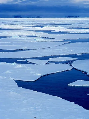
Figure 4 shows typical sea ice extent in the Arctic and Antarctic. Each map shows the extent of sea ice when the ice area is about halfway between the annual minimum extent and the annual maximum. Show students these two images near the start of the activity to provide them with a baseline sense of ice extent that they can refer to when exploring minimum and maximum extent. Notice that although the total area covered by ice is similar in each of the two polar regions (9.8 vs. 9.3 million square km), the shape of the sea ice pack is very different between the Arctic and Antarctic. As described above, the sea ice in the Arctic clusters towards the middle of the Arctic Ocean basin and covers the North Pole, whereas the sea ice in the Antarctic forms a rough ring around the continent of Antarctica.
When students analyze the long-term trends in Arctic and Antarctic sea ice minima and maxima, they should readily spot the decreasing trend in the Arctic minima in September. The other patterns are less clear, especially for the Antarctic data. Scientists, who have done a rigorous mathematical analysis of these trends, report the following average rates of change in sea ice extent, expressed in terms of average percent change per decade.
| Where & When | % Change/Decade | Uncertainty (%) | Time Span |
|---|---|---|---|
| Arctic, March | -2.7% | ±0.4% | 1979-2019 |
| Arctic, September | -12.8% | ±2.3% | 1979-2018 |
| Antarctic, February | +1.0% | ±3.7% | 1979-2019 |
| Antarctic, September | +0.5% | ±0.6% | 1979-2018 |
Why is the minimum sea ice extent in the Arctic rapidly dropping, while the extent in the Antarctic seems to be holding steady? The geography at each of Earth’s two polar regions is very different. The North Pole is surrounded by ocean and covered by a fairly thin layer, at most a handful of meters thick, of floating sea ice. The South Pole is on the continent of Antarctica, which in most places is covered with ice that is more than a kilometer thick. As Earth’s climate warms, ocean temperatures rise. Warming ocean waters flow beneath the Arctic sea ice throughout the Arctic Ocean basin, helping to melt sea ice all across the Arctic. Near Antarctica, on the other hand, the warmer ocean waters only interact with the floating sea ice around the edges of the continent. Because of this more limited contact between warming ocean waters and sea ice, the Antarctic is less prone than the Arctic to show the early effects of a warming climate.
The extent, in terms of area, is just one measure of the amount of sea ice. The thickness of the ice is also an important indicator of the reduction of ice mass. Ice builds up from one season to the next, never melting entirely in the summer, and can be several tens of meters thick. This “old ice” is much more resistant to melting away if there happens to be an unusually warm year or two. “Young ice”, which forms when open water freezes over in the winter, is typically much thinner - only a meter or two in depth. Thin ice like that can easily disappear whenever a warm season comes along. The amount of old, thick ice in the Arctic has been dropping rapidly in recent years, along with the area of ice extent. Some of the data at the NSIDC website portrays ice thickness if you want to investigate further.
Sea ice is just one of the interconnected aspects of the polar environments. Changes in sea ice extent and thickness alter other parts of high-latitude environments. For example, thinner sea ice coverage means more sunlight reaches photosynthetic plankton beneath the ice, changing their rate of growth and reproduction. Changes in sea ice coverage can also alter ocean currents, which in turn influences the flow of heat into and out of the polar regions.
Teaching Tips
To shorten the duration of this activity, you can have students plot only one year of monthly data from Tables 1 and 2. Or, you could have different students graph different years and then compare graphs to find that the pattern is the same.
When making predictions (hypotheses) about monthly Antarctic sea ice extent, many students may not take into account (or may not understand) the differences in seasons between the Northern and Southern Hemispheres. This can provide you with a very "teachable moment", and a great opportunity to discuss the cause of the seasons. The seasons occur because of Earth's axial tilt and not variations in Earth's distance from the Sun. If the latter was the cause, both hemispheres would have the same seasons.
Extensions and Variations
If you want to extend this activity, the website of the National Snow and Ice Data Center (NSIDC) has more data than we have presented here. You could have your students plot and analyze data for years or months that our data sets do not include, or for the most recent months. In this activity, students plot annual data at 5-year intervals, which saves time by reducing the number of points students must include. However, the data for every 5th year might not always be representative of the preceding and following years. Have students plot annual data for every year and compare that to a graph at 5-year intervals. Discuss the differences between the two graphs. Figure 5 shows annual maxima data plotted at yearly intervals, and Figure 6 shows the annual minima.

Figure 5: Annual Maximum Sea Ice Extent (all years)

Figure 6: Annual Minimum Sea Ice Extent (all years)
Mathematically advanced students could do a least-squares fit of a line to each (maximum and minimum) of the trends in the Arctic sea ice extent data to be more rigorous in their estimates of when the sea ice might be expected to disappear in the summer.
Variant: Plot Minima and Maxima on Same Graph
As an alternative to separate graphs of sea ice minima and sea ice maxima, have students plot all of the minimum and maximum data on a single graph (as in Figure 7 below). This approach saves paper, but the decline in Arctic minimum extent is less visually dramatic when viewed this way. Students might need extra prompting to recognize the significant decrease in sea ice extent during recent decades.
Figure 7 shows the four datasets all plotted together on the same graph. Figure 8 shows the same graph, but with data filled in for every year instead of 5-year intervals.

Figure 7: Annual Maximum and Minimum Sea Ice Extent
