About the Real-Time Weather Exhibit
About the Integrated Data Viewer
Unidata’s Integrated Data Viewer (IDV), which was used to power the Real-time Weather Exhibit, is a freely available 3D geoscience visualization and analysis tool that gives users the ability to view and analyze a rich set of geoscience data in an integrated fashion. The IDV brings together the ability to display and analyze satellite imagery, gridded data (such as numerical weather prediction model output), surface observations (METARs), upper air soundings, NWS NEXRAD Level II and Level III RADAR data, and GIS data, all within a unified interface. The IDV is used at many US colleges and universities, as well as a few countries for their national weather services. The IDV is freely available to the public via the Unidata Program Center, a division of UCAR/NCAR.
What are the layers shown in the Real-Time Weather Exhibit?
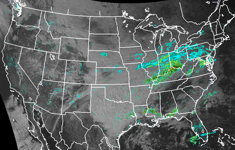
Current precipitation (radar)
The radar view shows where there is rain, hail, snow, or other precipitation, and how heavily that precipitation is falling. On this map you will see precipitation in a range of colors. The legend for these colors, also called a color ramp, is at the bottom of the screen. Blue and green represent light rain or snow; orange and yellow indicate heavy precipitation; and red, magenta, or purple, and sometimes white, mean severe rain and hail.
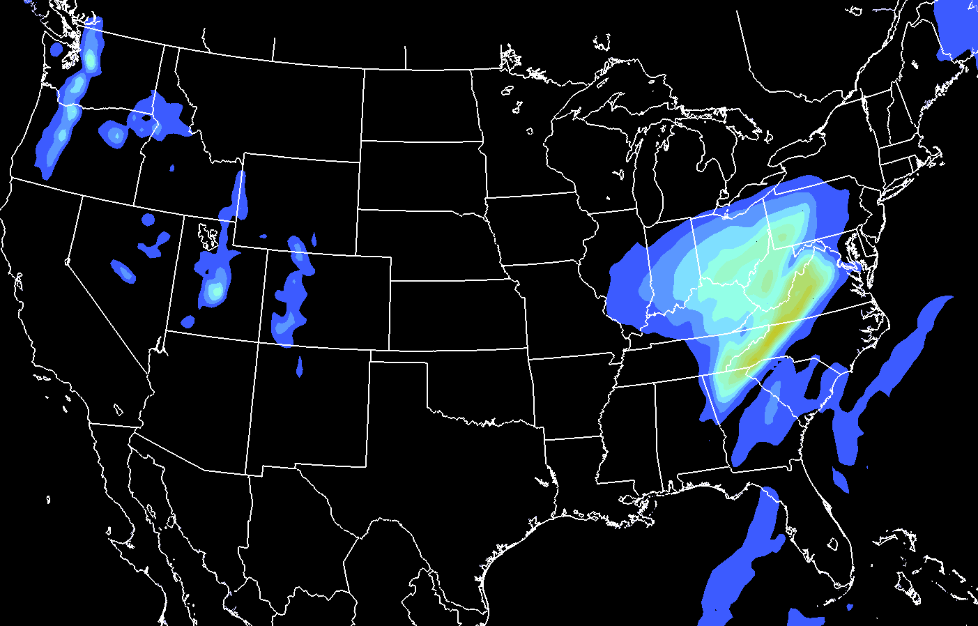
Future precipitation (model output)
In addition to the radar view of current precipitation, we can also see what computer models predict in terms of the amount and location of precipitation in the future. Like radar, this view uses a range of colors to indicate how light or heavy the precipitation, including rain and snow, will be. Unlike the radar view, the model forecast shows the precipitation with edges that are smoother because the forecast is more general than the actual current measurements we see with the radar.
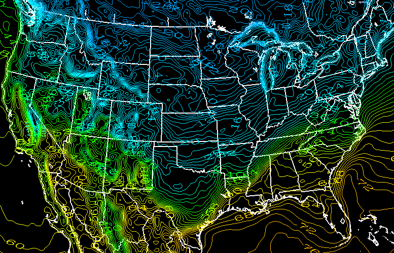
Temperature
The temperature view shows current temperatures in degrees Fahrenheit (°F). The colors represent specific temperatures, with a difference of two degrees between each color. The lines that mark the edges of each color are called isotherms, which are lines of equal temperature. The legend at the bottom of the map shows what each color represents.
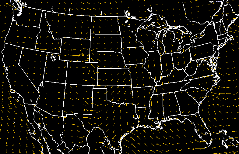
Wind Speed
The arrows on this map represent wind speed and direction. The bigger the arrow, the stronger the wind. The arrow points in the direction the wind is going, and the tail shows where it is coming from. On this map, you can see patterns in the current winds as air moves across the planet in different weather systems.