Just Add Humans: Model Simulations of 20th Century Climate
Commonwealth of Australia
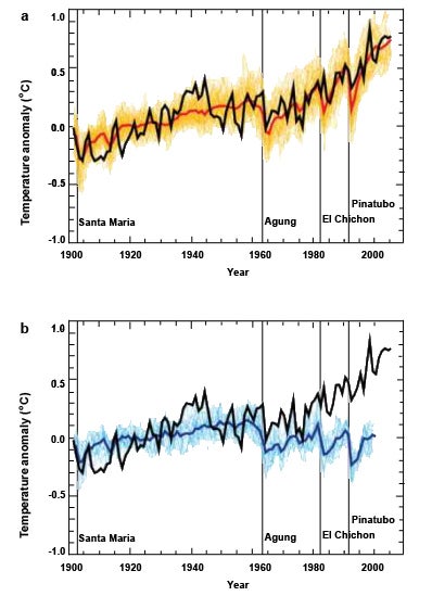
The red line on the upper graph shows how models simulated temperature over the 20th Century when human impacts on climate were taken into account. The blue line on the lower graph shows how models simulated temperature when humans were left out. The black line shows temperature actually changed. Which simulation best matches what actually happened? (These graphs, from the Commonwealth of Australia and based on the 2007 IPCC Forth Assessment Report, were made with information from 58 model simulations produced by 14 models.)