What Does it Mean to Change the Mean?
UCAR, Jerry Meehl
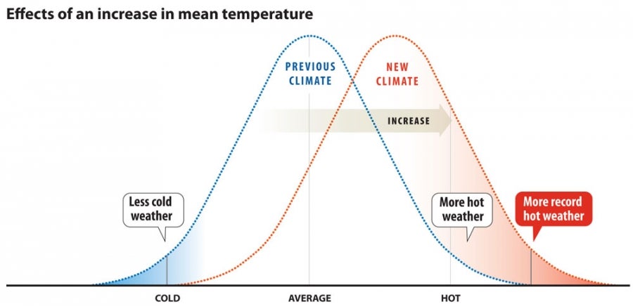
Imagine all the days in a year. Some are very cold. Others are very hot. But most days are somewhere in the middle. On the graph above this makes a bell shape (often known as a “bell curve”). The vertical axis is the number of days, meaning that very few days are at the hot and cold ends. Most days are in the middle. The average temperature, also called the mean, is in the middle.
Now imagine that the average becomes a bit warmer. Still, some days are cold and others are hot. And, still, most days fall somewhere in the middle. But now there are more very hot days and less very cold days. A small shift in average temperatures can result in a significant number of days with record heat. And fewer records are set for cold.
“A relatively small shift in the average produces a large change in extremes,” explains NCAR scientist Jerry Meehl, who created an earlier version of the graphic. “If you shift the whole distribution a little to the right you have more extreme heat. The tail on the far right moves into uncharted territory, breaking new heat records.”