Feeling the Heat
Students learn about the urban heat island effect by investigating which areas of their schoolyard have higher temperatures. Next, students analyze data about how the number of heat waves in an urban area has changed over time with population and other local and global changes. Each activity can be done separately or as a sequence.
This activity was updated in 2026 to include more recent temperature data and heat wave information.
Learning Objectives
- Students investigate how trees, grass, asphalt, and other surface materials affect temperature.
- Students hypothesize how surfaces that absorb heat might affect the temperature in cities — the urban heat island effect.
- Students analyze data about Los Angeles heat waves in a kinesthetic way, learning that the increase in the number of heat waves is due to urban growth and global warming.
- Students identify patterns in the Los Angeles climate data.
Materials
- Feeling the Heat slide deck
- IR thermometers (Alternative: digital pocket thermometers and 1-meter pieces of string)
- Clipboards
- Pencils
- Whiteboard or chart paper
- Projector
Preparation
- Part 1: Print copies of the Student Sheet for data collection (one per group of 3-4 students).
- Gather IR thermometers (one for each group of 3-4 students) or plan to use digital thermometers and string to ensure consistent distance for measuring.
- Part 2: Print and cut out sets of the Data Cards (one set for groups of 10 students).
Directions
Part 1: Understanding Urban Heat Islands
- Gather materials and head outside on a sunny, warm day.
- Provide each group with a copy of the student sheet, clipboard, and an IR thermometer (recommended) or a digital thermometer and a piece of string or ribbon. Instruct students on how to use the thermometers.
- If using IR thermometers, remind students to point the thermometer directly at the ground surface they wish to measure (i.e., concrete, asphalt, grass, dirt, etc.). See the Background section (below) for more information about IR thermometers.
- If using digital thermometers, remind students to keep it in place for at least two minutes and to shade the thermometer from direct sunlight while taking a measurement. To ensure each measurement is taken the same distance from the ground, students should measure from the ground to the top of the string/ribbon and then make their measurement there. (It's important that all groups collect data from the same height above the ground so that data can be compared.) Using this method on a windy day is not recommended.
- Ask students to look around and make predictions about which areas are the warmest and which are the coolest. Have students record their predictions under Step 1 of the student sheet.
- Choose 6-8 areas that students have identified to be the locations for collecting temperature data. Make sure that there is a mix of sunny and shaded areas as well as a mix of surfaces (paved, gravel, mulch, grass, etc).
- Assign each group to a different location. Instruct them to record descriptive information about their location and take five temperature measurements (step 2 & 3 on the student sheet).
- Back in the classroom, create a chart to display ground cover, sun/shade, and average temperature for each location (see below). Have each group calculate the average of their temperature measurements and fill in the data about their location on the chart.
- Give each group time to discuss the data and record their thinking in step 4 of the student sheet before moving on.
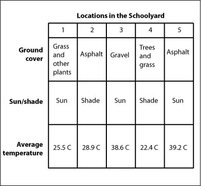
Make a chart for students to record class data collected from different locations in the schoolyard.
- Hold a class discussion to draw out student thinking. Which locations were the warmest or coolest? What patterns do students notice in the data? Do the results match their predictions? Ask students what aspects of the environment affect temperature in each area.
- Introduce the concept of microclimates (see Background section below). Microclimates allow different locations to have different temperatures. (The most likely result is that areas in the sunshine were warmer than those in the shade, and areas that had a paved surface were warmer than grass or natural areas.)
- Ask students, based on these results, which they think would be warmer: urban areas or rural areas. (In urban areas where surfaces like asphalt and concrete are abundant, temperature will be higher.) Introduce the concept of urban heat islands (see Background section below).
Part 2: Los Angeles Heat Through Time
- Ask if anyone has ever experienced a heat wave. Allow a couple students to share their experiences with and understanding of heat waves. (Refer to the Background section below for information about heat waves.)
- Tell students that in this part of the activity they will investigate heat waves and temperature in the city of Los Angeles, California over the past 100 years.
- Move to an open space and ask students to stand in groups of 10. Each group of 10 needs one complete set of Data Cards.
- Distribute a Data Card to each student. Make sure you have shuffled the cards in each group so that they are not in order. (Ensure that groups do not mix with each other. This will mix up the data.)
- Explain that each student has a piece of data about changes in Los Angeles over time. Point out the information that is on each card: dates, the population of Los Angeles during that time, the number of heat waves during that time, and the 10-year average temperature. Together, students in each group have 100 years of data.
- Challenge students to order themselves by average temperature. Note that students will need to have an understanding of reading numbers to two decimal places to do this part of the activity. You may wish to skip ahead to step 7 if this is too advanced for your students. (Optional: Have one person take pictures of the 10 students holding their cards so that the data is visible.)
- Discuss: Do you see a pattern in the temperature through time? Encourage students to look to their left and right to see what the neighboring students have. There is some variation in the data that might make the pattern difficult for students to see. If so, try the following exercise: Ask students to raise their hands if they have a data card that includes years before 1965. (Five students on the end of the line should raise their hands.) Ask students to raise their hand if they have a card with years after 1965. (The five students on the other end of the line should raise their hands.)
- Next, challenge students to arrange themselves by the number of heat waves on their card. Note that some decades may have the same number of heat waves. The students with those cards can stand next to each other in any order. (Optional: Have one of the students take another picture.)
- Discuss: When did the most heat waves happen? When did the least? Do you see a pattern in the heat wave numbers through time?
- Next, challenge students to arrange themselves by population. (Optional: Have one of the students take another picture.)
- Discuss: When were the largest increases in population? Is there any connection between population size and heat? Why might that be?
- Students can return to their seats.
- If you have been documenting the student groups with photographs, project these to the class. It may be easier for students to recognize the patterns of increasing average temperature, increasing heat waves, and increasing population through time from the photographs than it was when they were standing in the line.
- Discuss the data using the Feeling the Heat slide deck. The first several slides are designed to help students look for patterns in the data from the Data Cards that they were organizing. This allows students to look at the data in a different way. The latter slides are intended to help explain the reasons for local-scale warming and increases in heat waves. The following questions might be helpful as you guide the discussion:
- How has the number of heat waves changed over time in Los Angeles? (Generally, there has been an increase in the number of heat waves over the past 100 or so years. Longer heat waves are also more common today.)
- How has temperature changed over time in Los Angeles? (Generally, the average temperature has increased. But notice in the graph that there is a lot of variability from year to year.)
- Earth’s average temperature has increased. Could that affect the temperature of Los Angeles? (Scientists predict that there will be more heat waves in the future because of climate change.)
- How has the population changed over time in Los Angeles? How could a growing city affect temperatures in a place over time? (A larger city means more pavement and infrastructure and fewer trees or plants, and more cars, as examples.)
- What other changes can you observe from the information in the presentation? (Examples: Average yearly temperatures are increasing in both Los Angeles and globally. In a warmer climate, extreme heat events become more likely.)
Extensions
Part 1
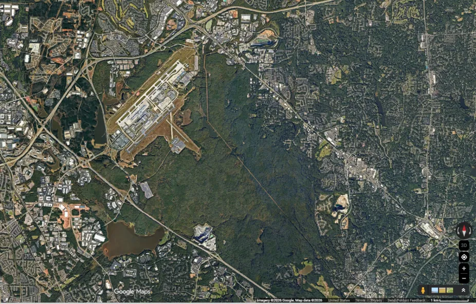
- Using Google Earth or satellite view on Google Maps, find locations in your city with various types of ground cover. Ask students to hypothesize how the temperatures might vary across the locations. As an example, consider the Raleigh-Durham International Airport and the neighboring William B. Umstead State Park in North Carolina (see image below). Large, unshaded, concrete runways at the airport will likely have higher ground surface temperatures than the shaded, natural terrain of the state park.
- Use ArcGIS to study Afternoon Heat Index data for select cities. Open the dataset in Map Viewer and set the basemap to “Imagery.” As a class, in small groups, or independently, students can explore select cities and compare the satellite view of the region to the afternoon heat index by toggling the layer on and off. What patterns arise? Are there correlations between the type of ground cover (e.g., rural vs. urban) and the afternoon heat index?
Part 2
- For practice with mathematical graphing, provide students with the Los Angeles data used in the lesson and have them practice graphing. Use the 10-year periods on the x-axis. For the simplest graphing, use the data set for “"Number of heat waves: 6 or more consecutive days" on the y-axis with a scale of 0 - 10. For the other data sets, students will need to use a different scale. “Avg. Temp (mean), degrees Celsius” is also easier to scale.
- Have students examine how average temperature has changed in their own city. Remind students to use a reliable source for their data.
- Looking at graphs of both the average temperature and number of extreme heat events, students may see noticeable increases after approximately the 1950s. Have students hypothesize and conduct research to learn about some factors that might contribute to this difference. (For consideration: How did the population change? Did car ownership change? What other large-scale changes might have been going on? How do politics and legislation affect the environment?)
Background
The Urban Heat Island Effect
The air in urban areas can be 2°C - 5°C (3.6°F - 9°F) warmer than nearby rural areas. This is known as the heat island effect. It’s most noticeable when there is little wind. An urban heat island can increase the magnitude and duration of a heat wave. It can also influence the weather, changing wind patterns, clouds, and precipitation. What makes cities warmer? There are many factors that can influence the urban heat island effect. The modifications to the land surface that are made in urban areas have a large impact on whether a heat island forms. For example, many cities have fewer trees than surrounding rural areas. Trees shade the ground, preventing radiation from the Sun from being absorbed. Without them, the ground surface heats up. Dark rooftops and dark pavement absorb more radiation than lighter surfaces, while tall buildings reflect and absorb sunlight. Automobiles, which make heat from their engines and exhaust, also contribute to the heat island effect. Fewer plants in urban settings mean that less evapotranspiration occurs, a process that cools the air. Today, many cities are making an effort to combat the heat island effect. White or reflective materials are being used for roofing and roads. Trees are being planted along city streets. And, in many areas, green roofs — living plants on rooftops — are being installed.
Microclimates
In Part 1 of this activity, students investigate relatively small differences in temperature in their schoolyard. These differences reflect different microclimates. The term microclimate can be used to describe differences in small areas of just a few square meters or much larger areas a few kilometers apart. Factors that contribute to microclimates in a small area like a schoolyard include the presence or absence of shade (from trees, buildings) and the type of material at the ground surface (dirt, grass, asphalt, concrete). Shaded areas are generally cooler since much solar radiation is unable to be absorbed by the Earth's surface. Ground materials like asphalt and concrete absorb solar energy readily and dark paving will typically be warmer than light color paving because dark colors absorb more heat.
IR Thermometers
Infrared thermometers (IR thermometers) are recommended for Part 1 of this activity. IR thermometers measure temperature by assessing the amount of energy emitted from an object. When sunlight hits Earth's surface, some of that energy is absorbed and some is reflected. The energy that is absorbed heats and is radiated from the surface. Students can alternatively use digital thermometers as long as they measure to tenths of degrees, but it might be more difficult for them to see the patterns emerge, especially if there is any wind.
Heat Waves
When unusually hot weather lasts for several days, it’s known as a heat wave. Heat waves are a danger to human health, causing heat stroke, heat exhaustion, cramps, and other ailments. Researchers have found that Los Angeles is now experiencing more heat waves and more extreme heat days than it was in the past, and these changes are also apparent in the information on the Data Cards provided. While Los Angeles is used as the example in this activity, it is not the only location where heat waves have increased. Studies of past data and projections of future temperatures indicate that heat waves are already becoming more frequent and will continue to become more common in cities in the U.S. and worldwide during the 21st century (IPCC, 2021; USGRP, 2023).
Data Sources and References
- Definition of a heat wave: Tamrazian, A., S. LaDouchy, J. Willis, and W.C. Patzert (2008) Heat Waves in Southern California: Are They Becoming More Frequent and Longer Lasting? APCG Yearbook, Vol. 70, pp. 59-69.
- Definition of extreme heat from the United States Environmental Protection Agency. Accessed May 2026. https://www.epa.gov/climatechange-science/extreme-heat
- The heat wave data on cards was compiled from: NOAA National Centers for Environmental Information, Local Climatological Data Version 2. Accessed May 2026.
https://www.ncei.noaa.gov/access/search/data-search/local-climatological-data-v2 - 10-year average temperatures are from NOWData - NOAA Online Weather Data - LA Downtown Area. Accessed May 2026.
https://www.weather.gov/wrh/climate?wfo=lox - Population totals are from the US Census Bureau. Accessed May 2026.
https://data.census.gov/ - Projections for future heat waves worldwide: IPCC, 2021: Summary for Policymakers. In: Climate Change 2021: The Physical Science Basis. Contribution of Working Group I to the Sixth Assessment Report of the Intergovernmental Panel on Climate Change. Cambridge University Press, Cambridge, United Kingdom and New York, NY, USA, pp. 3−32, https://doi.org/10.1017/9781009157896.001.
- Projections for heat waves in the U.S.: USGCRP, 2023: Fifth National Climate Assessment. Crimmins, A.R., C.W. Avery, D.R. Easterling, K.E. Kunkel, B.C. Stewart, and T.K. Maycock, Eds. U.S. Global Change Research Program, Washington, DC, USA. https://doi.org/10.7930/NCA5.2023.