Show Your Stripes Art
Create colorful art to learn about changing global temperatures, which are represented as different colored lines in the Show Your Stripes project.
What you’ll need:
- Temperature stripe map (from Show Your Stripes)
- Art supplies- use whatever is handy to represent the the temperature stripes in your map:
- Colored pencils, crayons, markers, paint, or yarn
- Images from magazines for collages, stickers
- Glue or tape, scissors, rulers, colored paper, string or twine
- Computer for digital art creations
Directions:
Choose Your Temperature Stripes Map
- Go to the Show Your Stripes website.
- Select the region, country, and location for a temperature map for your area (e.g., North America, United States, Chicago).
- Find the Global Temperature Change map with “labelled stripes” for your location and download it.
- Use your stripes map as a template to make your own color stripes artwork.
Make Your Own Art Creation
- Select an entire map or a section of your map to make your art creation. You’ll want to include at least 30 years of data to show how temperature has changed over time. For example, you could choose the stripes from 1960 to the present.
- Represent the stripes in your map using any type of art media: yarn, colored markers or pencils, crayons, watercolor, collage, digital art, etc. For younger children, glueing colored yarn directly on a printed map is a fun way to get them involved.
- Be creative! Use your imagination as you decide how to use the maps in your artwork. For inspiration, go here.
- Compare maps of other cities or countries, and use them for your art projects as well.
- Share your art with others and have a conversation about changing temperatures in your area.
Some examples of temperature stripes artwork:
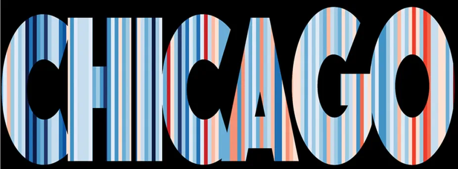
A digital art version of the temperature stripe map for Chicago, 1850 - 2024.
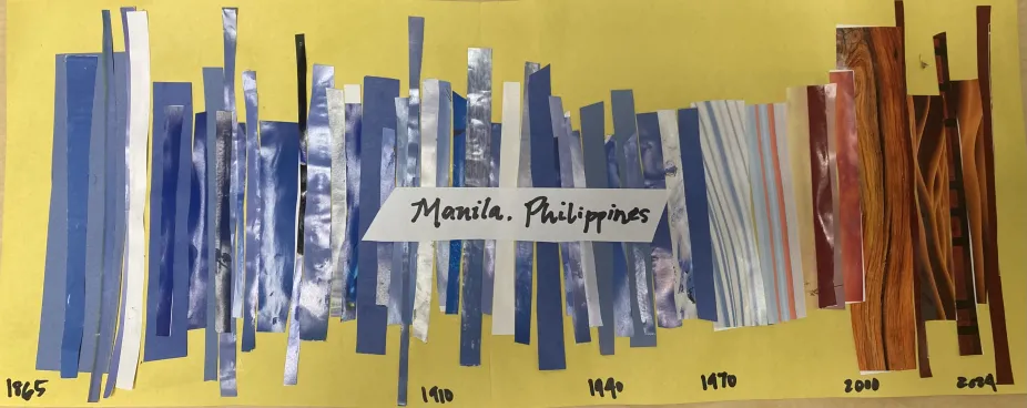
A collage art interpretation of the temperature stripes for Manila, Philippines, 1865 - 2024.
What Are Temperature Stripes?
Ed Hawkins is a professor at the National Centre for Atmospheric Science at the University of Reading in England. He wanted to find a way to represent global temperatures in a simple, easy-to-understand way. He did this by creating maps using colored stripes to represent changes in temperature at different locations around the world.
The striped map marks out the amount of change in average temperature for a given location. Blue-colored stripes represent decreases in average temperature and red-colored stripes represent increases in average temperature over the last 150 years. The maps indicate that overall, temperature has been warming across the globe over time.